Service Tip: Getting the Most out of the SMA Energy App

The display, in particular, plays an important role for users of the SMA Energy app, which is reason enough to focus on making further improvements to it in all our development.
 What do the graphs in the SMA Energy app display?
The sun is shining – and a quick glance at the app will confirm that now is the perfect time to start the washing machine or charge your electric car. But the graphs can do a lot more than just provide information on the amount of solar power generated.
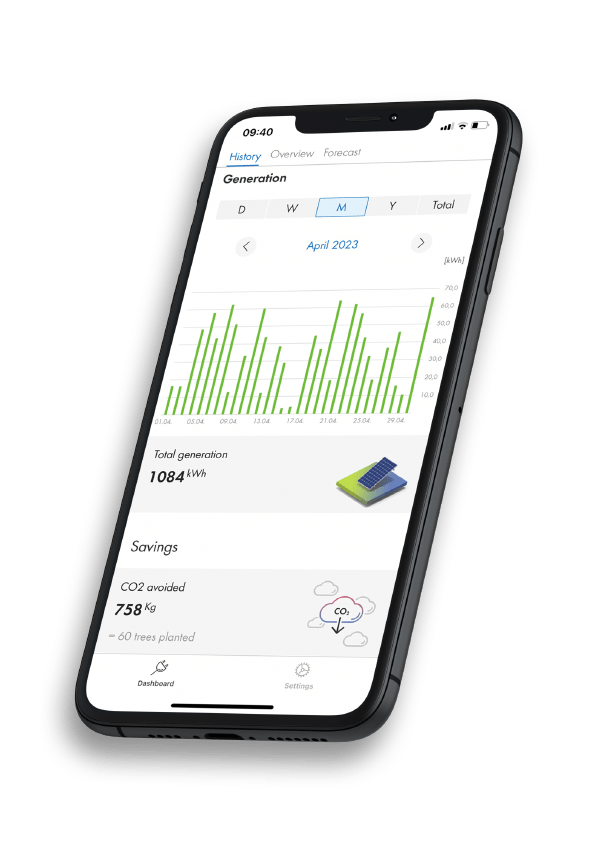
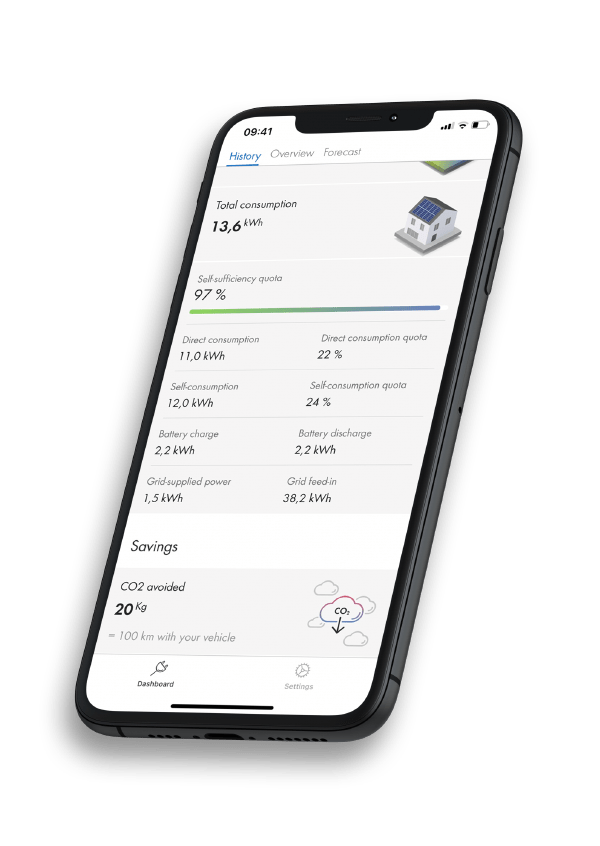
Power generation and CO2 savings
How much solar energy did my system generate last week? And what CO2 savings have I made to date since installing the system?
It is possible to call up these figures in a detailed view in the graphs starting from the date on which the system was put into operation. If you press on a particular date (and time) in the graph, a flag will display the precise figures for that date and time.
Even more options with the Sunny Home Manager 2.0 and the SMA Energy Meter
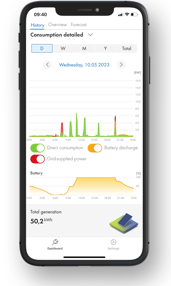
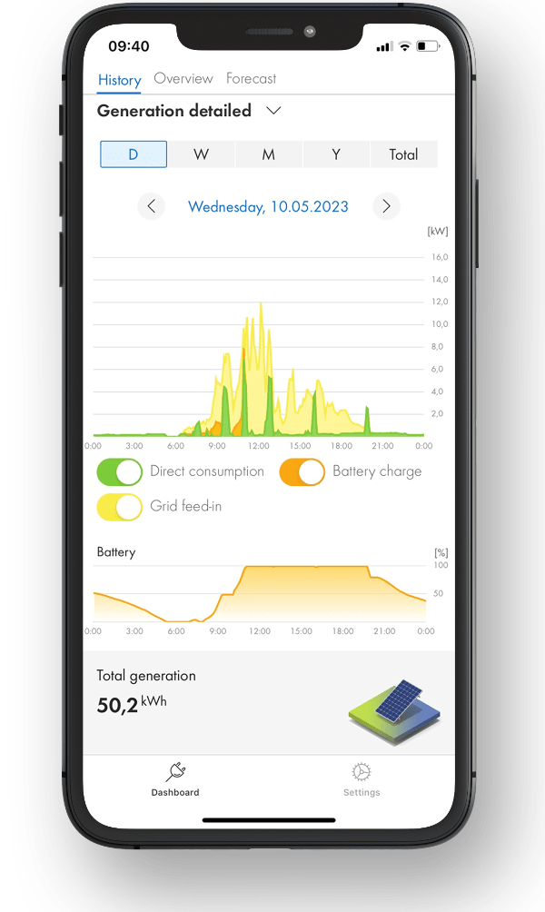
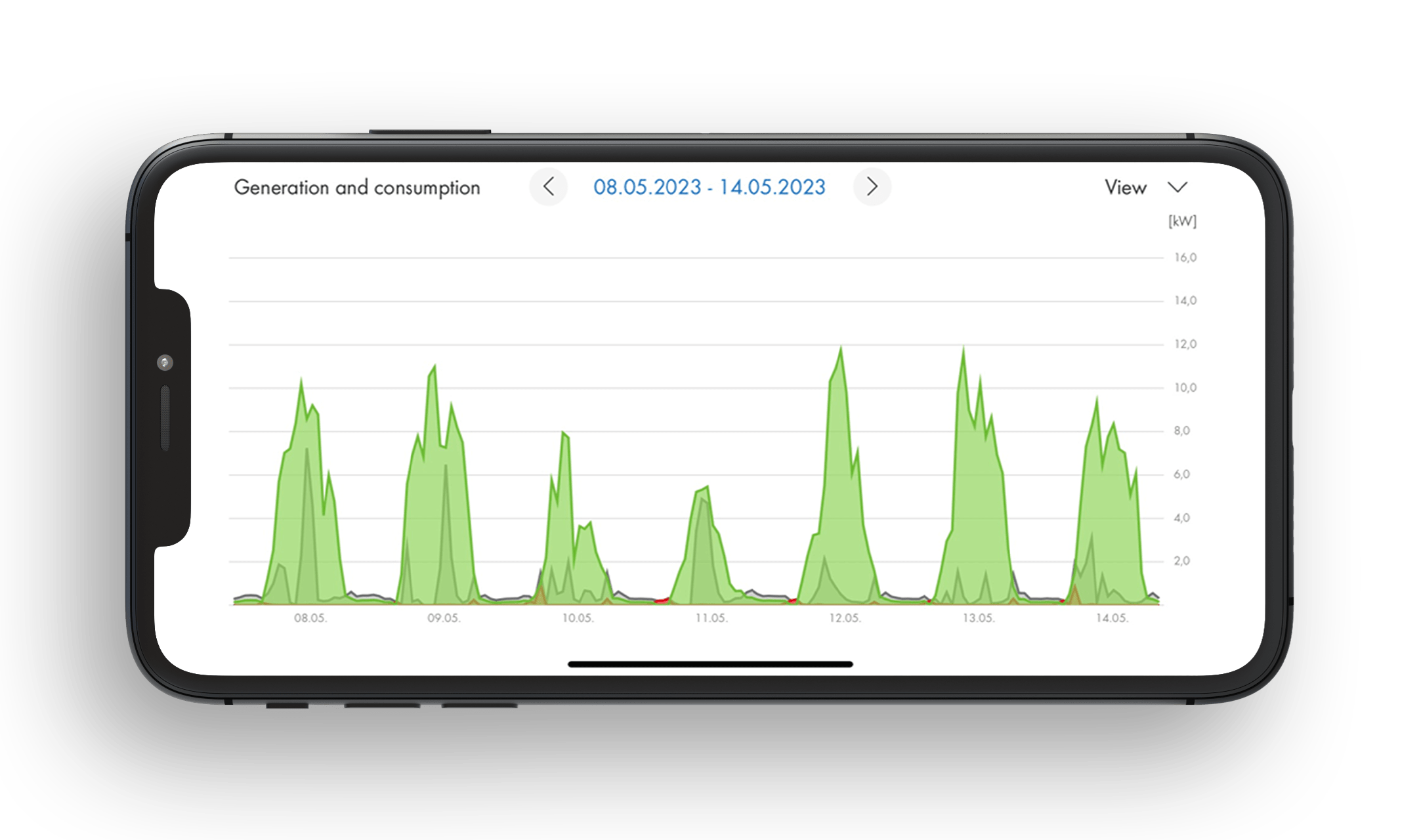
If a Sunny Home Manager 2.0 has been installed, system operators will have even more options available to them. All you have to do is change one small setting in the tab “History” and a number of consumption and generation modes will appear. Simply tap the small arrow next to “Generation and consumption” and and switch between various detailed analyses of individual generation.
- Detailed consumption: Direct consumption, battery discharge and purchased electricity
- Detailed generation: Direct consumption, battery charging and grid feed-in
- Generation and consumption: Generated power, purchased electricity and consumption
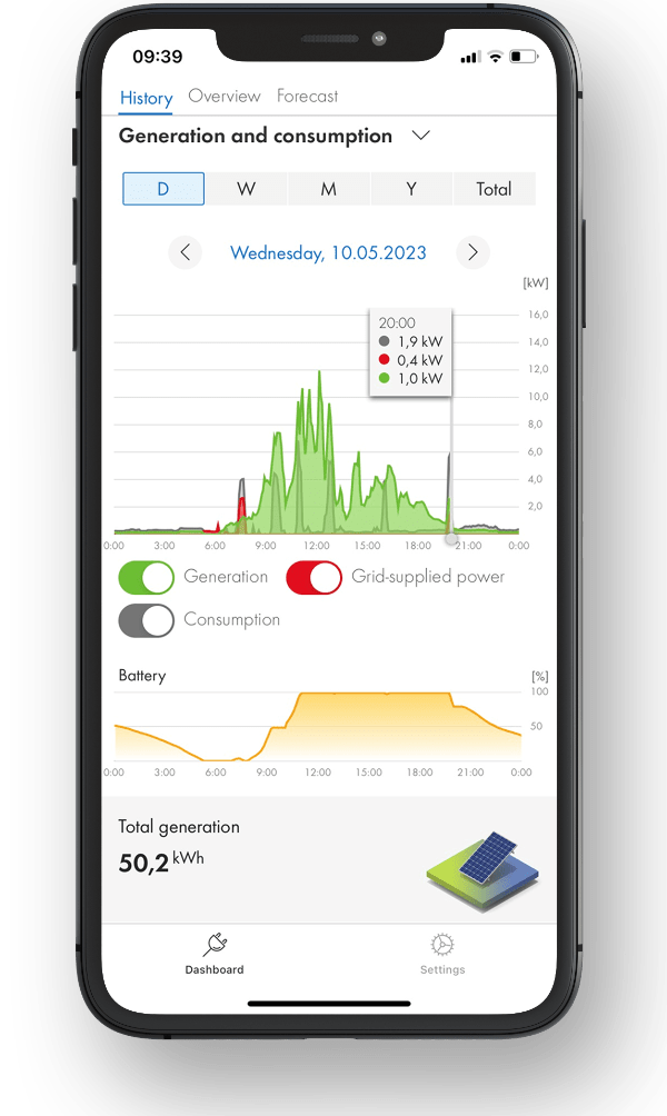
The Sunny Home Manager 2.0 provides detailed figures that are even more informative, such as the system‘s self-sufficiency quota, which gives the current ratio of energy self-sufficiency to total consumption. Here, energy self-sufficiency represents the power that your household is drawing directly from your PV system (direct consumption) and the battery (battery discharge).
The self-consumption quota is another figure that may be of interest. It shows the current ratio of self-consumption to PV generation. Here, the self-consumption represents the power that your household is drawing directly from your PV system (direct consumption) and the power that your PV system is storing in the battery (battery charging).
Everything at a glance
 The scaling has been upgraded so there is no need to scroll anymore, which means that the relevant time period is now completely visible. This gives you a better overview and makes it easy to compare data. The zoom feature means that it couldn’t be easier to get a detailed look at the graphs and the figures displayed.
Clicking on the magnification icon in the top left-hand corner of each diagram will display the graph with full scaling for the desired time period.
By clicking on the filter symbol, the perspectives can also be changed in landscape format and graphics can be removed or added
You will find more information and breakdowns in the FAQ on our product page.
please keep SolarCoin support